

Monday, July 26, 2010
Loveseat Sketch
This loveseat sketch in 2 point perspective is one of my favorites simply because I love this style of furniture. I really want this loveseat! I like drawing in 2 point perspective because I find that I can conceptualize what the image I am drawing will look like easier. I used some hit-go-hit when I could remember to and some crossed edges.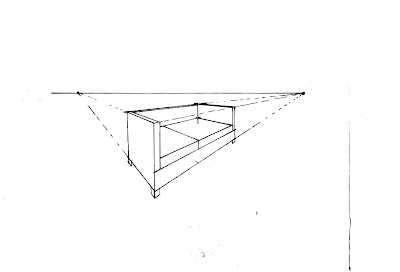
First 2 Point Perspective Sketch
This was my first 2 point perspective sketch and I have to say that I am very proud of it. For years I have wanted to know the secrets of how to draw just the right angles and here I did it in less than 10 minutes! There could have been lots of detail to add to this drawing but I like the simplistic, stark form of the architecture of the building. By leaving off the fine detail you can see the bones of the drawing itself.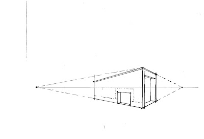

Two Chairs
These free hand chair sketches were composed at the very beginning of the class. I found inspiration for these very different styles in an Architectural Digest magazine. I was, and still am, learning how to draw but I think these two chairs show different understandings of how to convey on paper what you see in real life. I like the detail of the right chair, while the left chair had something go awry with the angle of the seat and legs. Oh well, its all a learning process.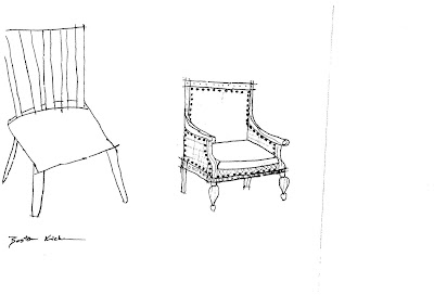

Sketch of Keys
This sketch of my keys shows good use of line weights. I was also exploring how to convey some 3D. Some shading here would really help with the 3D effect.

Table Sketch in 1 Point Perspective
This table sketch is not as clean as my end table sketch. I tried to again practice the hit-go-hit and crossed edges. I also had some trouble finding the right leg length.

Sketch in 1 Point Perspective
This is one of my first sketchs in learning 1 point perspective. I understood and grasped the concept pretty easily. I was really trying to emphasize the hit-go-hit and crossed lines.

Mapplethorpe Process Poster
I have been developing a room design for Robert Mapplethorpe, a photographer from the 1970's and 80's, by using quotes as inspiration and studying the principles and elements that are consistent in his work. I found a pineapple to be a perfect natural representation of his work. Using the pineapple's shape, I created a space for Mapplethorpe to think. Then I made this poster to show the process of my work. It has the quote I worked from, my drawings of the pineapple, some sketches of my thought process, and finally the finished model. The poster also has concept statement that explains the thought process as well. I created the poster in InDesign. Again, I found that I made the images larger than they really need to be, which sacrificed room for text and overall text size. However, I am happy overall with the poster. I like all the lines, picture sizes and how they line up, the general flow of the poster and left hand margin. 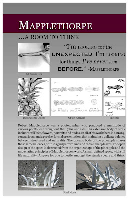.jpg)
.jpg)
Heritage Textile
I created this textile design to reflect my heritage. Currently, my parents are orchardists in central Washington. They grow all kinds of pears including Bosc, D'Anjou, Bartlett, Star Crimsons and a few other varieties as well. I feel that this is just as much a part of my heritage as this is more related to me personally than the countries my ancestors came from. I also used the filigree columns and ellipse to represent the German Lederhosen. While I am primarily of German heritage, wearing Lederhosen on Halloween is about as in tune with it as I get. In the center of the ellipse I added the animal representation for the Okanagan Native American tribe. While I am a few generations down the line, and my family has never represented ourselves as Native American, it is not something that I shouldn't acknowledge about my lineage. I created the textile in photoshop with images I collected from the internet. I chose blue, because the textile being about me, is my favorite color. I like that the pattern repeats itself cleanly, meaning that it is nearly impossible to see any seems.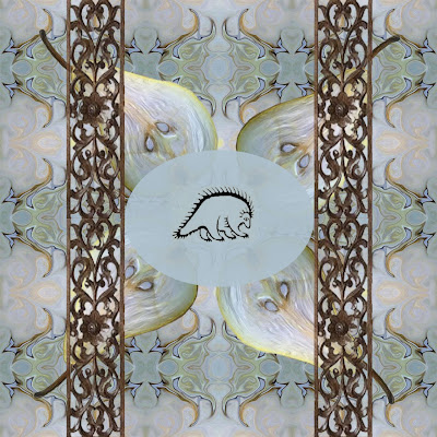

My Favorite Images Quilt
I made a quilt pattern design by using some of my favorite photographs or photographs of my favorite things and manipulating them in photoshop. There are two Robert Mapplethorpe photographs, a favorite celebrity of mine, water, and even two types of raw meat. I manipulated the color, texture and shape of every photograph, some beyond recognition, to harmonize and create a cohesive design. I chose to bring out the blue in almost every picture, it being my favorite color. I left the steak it's intense red to contrast the cooling blues and greens that surround it. I would like to have made some of the photographs more unrecognizable, as I feel that it distracts the eye too much.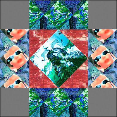

Subscribe to:
Comments (Atom)