Thursday, December 16, 2010

Master Bathroom Project


The inspiration for this room came from a children's book about Africa. I felt that this was appropriate given that the overall concept was inspired by a quote about Africa. The many colors of Africa run the entire spectrum. There are the hot colors of red, orange and yellow. And the cool colors of black, purple, indigo and blue. When these two spectrums meet you get green in the middle. Green is the symbol of growth and vitality, very appropriate for designing for a child because as a designer you want the spaces they are in to inspire them. Focusing on primary colors and dividing the room into three sections to highlight three very different areas of the room. When first entering the room you are drawn through a hot, exciting red tunnel towards a bright, cheery green wall. This red area is to inspire activity. The dresser is placed here so as to motivate the children to dress quickly. Once you pass through the red room, you enter the green space. Here is a desk for two, to provide a space to study and learn. To the left of the green room, are the beds. The bedroom walls are a tranquil blue to provide a restful and quiet area, perfect for sleeping.

Kitchen Design Project


In designing the Gregory's kitchen, there were a lot of factors that had to be considered and brought together to create a seemless, efficent space. Patti, who is a wheelchair user, is one of the main users of this kitchen and therefor it needed to fit her needs. Countertops, shelves, cabinets and appliances all needed to be accessible.


In the design, I was keeping in mind my concept of influence and impression. The central oval island's curves 'push' out and impress curves into the surrounding counters and banquet. Wide 4' aisles and expansive lowered counters provide abundant work space for all users. Multiple sinks allow for dishwashing to be seperate from more quick applications like getting drinking water or quick rinsing.


Concept Development


From a long quote by an idol of mine, Karen Blixen (Isak Dinesen), in which she describes how much Africa changed her life and made such an impression upon her but wonders if she left any impression upon it, I developed my concept for the Gregory apartment remodels. The quote is about being so influenced by something that it changes you and you will forever have the impressions that it left upon you. I think this relates very importantly to the way one should feel about their home. Home's decor, style and all it's associations have forever influenced everything about us.

From this idea of influence and impression, I sketched some parti drawings reflecting these ideas. A dominate shape of curves, similar to a ripple effect, started to emerge. An idea of an implication of constant movement was formed. And upon this path, representations of influence would be present.

My model shows these ideas through its curving shape, implying continuity, and through abstract representations of a figure moving along the path, encountering another larger object, passing through that object and coming away with something from that object.


Wheel Chair


Ride, Don't Walk...


I had rarely thought about the challenges that a person who uses a wheel chair would face on the WSU campus until I learned that we would have to experience it for ourselves. I instantly started to focus on all the hills and the rough, treacherous sidewalks. Starting in Daggy Hall on the 3rd floor, I entered the elevator to descend to the basement parking garage. Upon entering the elevator, I found it very difficult to maneuver towards the floor destination buttons. I was the only person in the elevator and I'm sure I would have bumped another person if they were sharing the space with me. I exited the elevator and thankfully found a door with an electric opening device. Easily maneuvering through the generous 4' doorway I now found myself outside.
I mustered all of my upper body strength and pushed myself up the incline out of the parking garage. Now I was approaching the South entrance of Carpenter Hall. There is a ramp to the West of the entrance and I found it very difficult to push myself up it. Again, I was very relieved to meet another electric door. However this time, I was very conscious of my knuckles as I wheeled through the very narrow opening. Once inside, I made my way easily across the stone floor fighting absolutely no friction. I was headed to the library. This proved problematic. Upon trying to open the very heavy, resistant metal door, and still trying to remain seated, I was in a tug of war battle with this door. Cursing and making quite the scene, I continued to battle the door. If I could get the door open enough holding it with one hand, I would lose control of the door when I would try to wheel in. After making quite the scene, a very nice gentleman inside the library got up to come help me get in. I can't imagine how a person who regularly uses a wheelchair would feel, knowing that there are places they can't get into without the help of someone else. It really makes me conscious now about how I will design doors and doorways.
Now that I was finally in the library, I was in search of a book. Easily navigating the sections, I found the book. It was easy enough to reach, but I noticed that there were more books that I couldn't reach than there were books I could reach. I wouldn't have been able to retrieve a book from half of the other shelves without the assistance of another person. Now it was time to leave. The aisle I was in was on the outside of the rows and was generously wide, but not enough to turn around. I continued down the aisle and planned to just double back in the next aisle over. This proved very problematic, and frankly distressing, as the aisle was just BARELY wide enough for me to travel down. There were spots where I couldn't fit through unless I moved books to a different spot because they were sticking out too far into the aisle. I had fears of knocking down shelves or the entire bookcase. Finally, I made it to the end of the aisle and again, a very nice gentleman opened the door me.


Monday, July 26, 2010

Loveseat Sketch

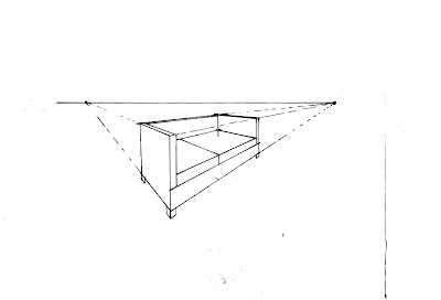
This loveseat sketch in 2 point perspective is one of my favorites simply because I love this style of furniture. I really want this loveseat! I like drawing in 2 point perspective because I find that I can conceptualize what the image I am drawing will look like easier. I used some hit-go-hit when I could remember to and some crossed edges.

First 2 Point Perspective Sketch

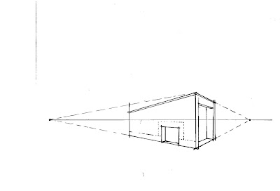
This was my first 2 point perspective sketch and I have to say that I am very proud of it. For years I have wanted to know the secrets of how to draw just the right angles and here I did it in less than 10 minutes! There could have been lots of detail to add to this drawing but I like the simplistic, stark form of the architecture of the building. By leaving off the fine detail you can see the bones of the drawing itself.

Two Chairs

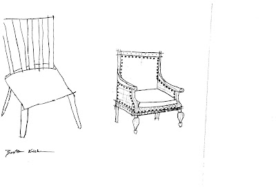
These free hand chair sketches were composed at the very beginning of the class. I found inspiration for these very different styles in an Architectural Digest magazine. I was, and still am, learning how to draw but I think these two chairs show different understandings of how to convey on paper what you see in real life. I like the detail of the right chair, while the left chair had something go awry with the angle of the seat and legs. Oh well, its all a learning process.

Sketch of Keys

This sketch of my keys shows good use of line weights. I was also exploring how to convey some 3D. Some shading here would really help with the 3D effect.

Table Sketch in 1 Point Perspective

This table sketch is not as clean as my end table sketch. I tried to again practice the hit-go-hit and crossed edges. I also had some trouble finding the right leg length.

Sketch in 1 Point Perspective

This is one of my first sketchs in learning 1 point perspective. I understood and grasped the concept pretty easily. I was really trying to emphasize the hit-go-hit and crossed lines.

Mapplethorpe Process Poster

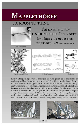
I have been developing a room design for Robert Mapplethorpe, a photographer from the 1970's and 80's, by using quotes as inspiration and studying the principles and elements that are consistent in his work. I found a pineapple to be a perfect natural representation of his work. Using the pineapple's shape, I created a space for Mapplethorpe to think. Then I made this poster to show the process of my work. It has the quote I worked from, my drawings of the pineapple, some sketches of my thought process, and finally the finished model. The poster also has concept statement that explains the thought process as well. I created the poster in InDesign. Again, I found that I made the images larger than they really need to be, which sacrificed room for text and overall text size. However, I am happy overall with the poster. I like all the lines, picture sizes and how they line up, the general flow of the poster and left hand margin.


Heritage Textile

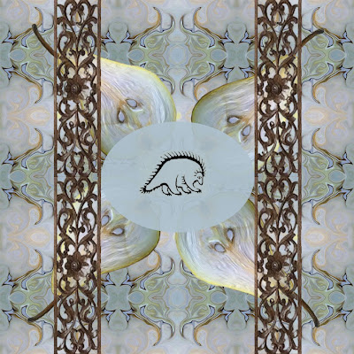
I created this textile design to reflect my heritage. Currently, my parents are orchardists in central Washington. They grow all kinds of pears including Bosc, D'Anjou, Bartlett, Star Crimsons and a few other varieties as well. I feel that this is just as much a part of my heritage as this is more related to me personally than the countries my ancestors came from. I also used the filigree columns and ellipse to represent the German Lederhosen. While I am primarily of German heritage, wearing Lederhosen on Halloween is about as in tune with it as I get. In the center of the ellipse I added the animal representation for the Okanagan Native American tribe. While I am a few generations down the line, and my family has never represented ourselves as Native American, it is not something that I shouldn't acknowledge about my lineage. I created the textile in photoshop with images I collected from the internet. I chose blue, because the textile being about me, is my favorite color. I like that the pattern repeats itself cleanly, meaning that it is nearly impossible to see any seems.

My Favorite Images Quilt

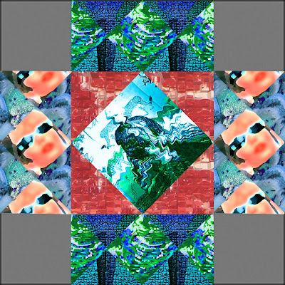
I made a quilt pattern design by using some of my favorite photographs or photographs of my favorite things and manipulating them in photoshop. There are two Robert Mapplethorpe photographs, a favorite celebrity of mine, water, and even two types of raw meat. I manipulated the color, texture and shape of every photograph, some beyond recognition, to harmonize and create a cohesive design. I chose to bring out the blue in almost every picture, it being my favorite color. I left the steak it's intense red to contrast the cooling blues and greens that surround it. I would like to have made some of the photographs more unrecognizable, as I feel that it distracts the eye too much.

Monday, June 28, 2010

Principles and Elements of Design

Using images I collected around the WSU campus, I composed posters to represent the principles and elements of design. There are examples of different lines, balance, shapes, colors, etc. I made the posters in InDesign. They were printed at 18" x 24". I wanted the images to be large so that it would be easier to see the principle or element that it represented. But this resulted with the text, which were descriptions, definitions and sources, being cramped and too small. Not so much that it was difficult to read, but in appearance off balance.