Friday, May 6, 2011

[depot] Final Boards


The Pullman depot station was built in 1910 for the bustling city of Pullman. 100 years later, the grand building is going to be restored and renovated into an intimate guest inn and event space. This is my design for the interior. My concept for the design comes from an original radiator and the work of Washington native glass artist, James Nowak. His art creates the illusion of depth and have been applied to the spaces within the depot to make them feel larger, grander.


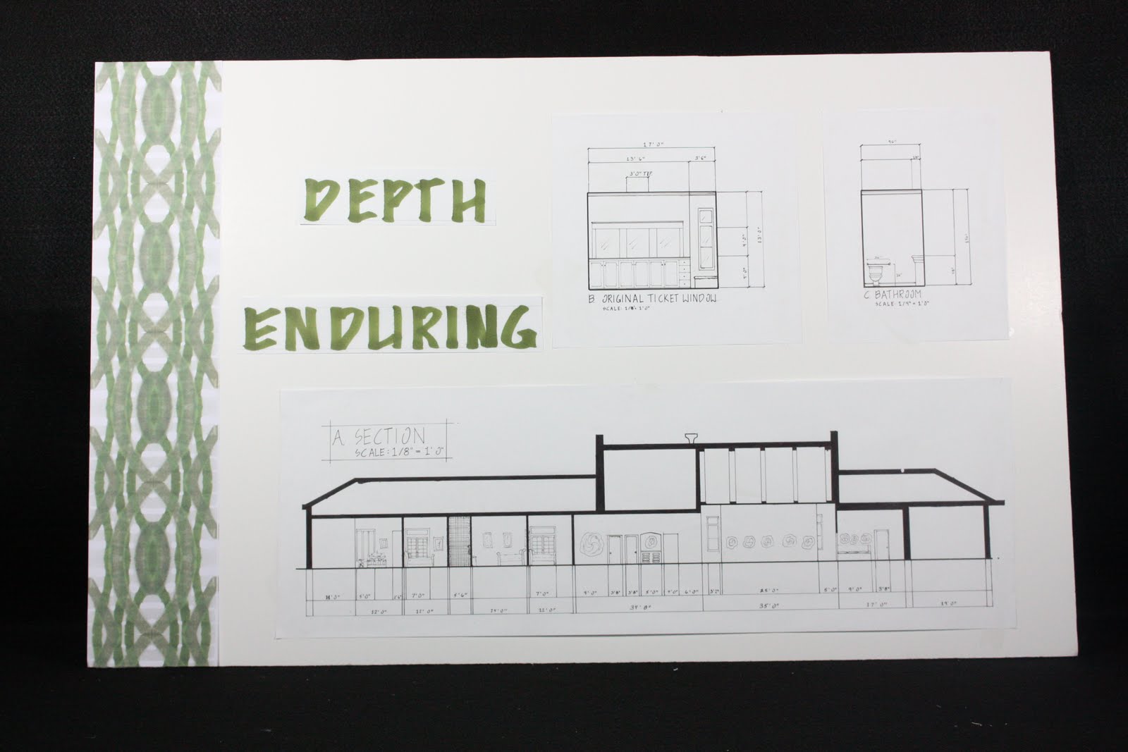
The space consists of the main Lobby, off of which are the meeting room and event space, which holds parties of up to 50 people. A commercial kitchen is close by as well as two unisex ADA bathrooms. As you continue further into the building the spaces become more private. A formal dining room and lounge are right off a secondary entrance and act as a social place for guests of the inn to socialize. There are three guestrooms, one of which complies with ADA standards. On the end of the building is a studio apartment for the innkeeper and their spouse.


The furnishings and decor of the space are inspired by the timelessness of the original radiator and the glass work of James Nowak. Heavy antiques fill the rooms adding to the timeless feel of the depot.


I am very pleased with my design for the space and I feel that it is very appropriate for the historical significance of the building and it's new endeavor.


Monday, April 18, 2011

[depot] Boyer Park


Together with a group of my peers, we redesigned an existing event space for the management of Boyer Park. They had enclosed a large concrete pad but had not finished the interior. There was only one stipulate to the project and that was that we had to maintain the existing arched wood ceiling beams, which were in fantastic condition.


When looking for inspiration for a concept for design, the surrounding landscape and the Lewis and Clark Trail, which runs right through the space, were immediate inspiration pieces. The landscape provided the color palette and material choices and the trail provided direction.


Because the trail leads right up to the front door, we chose to use long cedar decking to further the feeling of still being on the trail. Stained concrete provides a durable flooring surface for the majority of the space. Natural elements like wood and glass complete the rustic elegance of the Boyer Park Event Space.

Monday, April 11, 2011

[depot] concept development - concept model


To create another form of concept development, I adapted my 2-dimensional parti into a 3-dimensional model. I used the inspiration of radial lines that are growing, rising, and overlapped them with smaller radial patterns. I used a cold, industrial color palate that is representative of the material used in the construction of the radiator. When look at from an angle or in elevation, the model is growing, like heat waves rising off the radiator. But, when looked at in plan view, it is solid, no movement, much like when a radiator is turned off.


Parti:


Model:


[depot] concept development - textile

How I developed a textile:


I first started with an inspiration object, something that was in some way related to the Pullman depot, whether it be something physical about the building itself, or something related to trains and depot stations. I was immediately attracted to a radiator located just off the main entry. It has clean, wide planer, horizontals lines that are smooth and free of any ornate designs that I typically see on radiators of this same shape. These horizontal lines round on the top and are sharp, almost blade like.


I examined these shapes and elements and analyzed them.


I then took these elements and principles and applied them 2-dimensionally.

Then after making around 50 of these, I selected 8. I then took one of those and made a pattern from it.


I selected one of these:


And created a pattern from it:


And then sent it out to Spoonflower.com to be made into a textile.


Textile Reflection Essay


The blurring and crisscrossing of heat waves were the inspiration for my textile design. I chose to keep the textile in its original colors because when those colors were manipulated, it lost the effect of the natural bleeding and blurring. I also chose to keep the pattern at its same scale because the blurring and bleeding, and the hierarchy of the layers were very clearly represented at this size. If it had been smaller, these attributes would have been harder to see. If it was any larger, it would have been too distorted and errors would have been very noticeable.


When I plotted the textile for production, there was a thin white line that appeared. It didn’t appear as a repeat, but as more of a glitch, as it wasn’t in the same place within the pattern repeat. Unfortunately , when I got the textile the white lines were much larger and very obvious. The color pattern and scale turned out great though. The blurring and bleeding of lines and colors reads beautifully. There is a depth to the textile through the many layers. To fix the white line problems, I would adjust the repeat again through photoshop.

[depot] artist poster

I chose the work of glass artist James Nowak as the inspiration I would be using for the concept of designing the Pullman Depot station. I would be using his philosophy of creating art with depth that plays between chaos and boundary for the inspiration of the design of the interior. I made this poster to describe how I would apply this philosophy, as well as to explain a little bit more about James Nowak as an artist. I also included three pictures of his work and a quote from him, all of which help to exemplify my concept. The poster itself is very effective and aesthetically pleasing, I think. It functions almost as an advertisement, or 'flyer', explaining to those curious few what will be happening in the old Pullman depot.

[depot] context poster

Before starting the process of designing the Pullman Depot, groups were formed and each focused on particulars related to design of the same era that the Pullman depot was built. Some had prominent architects, while others had popular design styles. I was in the latter group and focused my research on the Queen Anne period of the early 1900's. After researching about the specifics of the style and gathering images, I composed a small poster to present the information I had found. The layout and style for the poster was decided upon in my group so that all of our posters would have a consistent, cohesive look. The pictures are of a great, readable size when printed, but there is a lot of blank space. I would change how narrow the three columns are by widening them, and maybe making the text larger. The three columns work well as they grid the poster out in 3rds.

Tuesday, April 5, 2011

Habitat for Humanity- Simple.Basic.Decent

Simple.Basic.Decent is the mantra of Habitat for Humanity. They strive to construct homes for those in need that represent these principles. It was incredibly important to both my partner and I that we too adhere to these design principles for our design. With these goals in mind, we set out to design a new, efficient as possible design.


The central focus of our design was to have a floor plan that was interesting and functional. To add interest and a hand-crafted look, we included lots of built in storage and shelving, a banquet in the kitchen, and a small study nook. These little details add lots of charm and give the home a timeless feel.


In addition to the architectural details, we also made efficient use of construction materials. The exterior walls are doubled, and the studs are placed 2ft apart. This provides better insulation. Windows are strategically placed between the 2ft studs. On the interior, a central plumbing wall houses all of the plumbing for the house. The sinks, dishwasher, tub, toilet, and washing machine all line this T-shaped wall. And with the wall having no exposure to the exterior, there is no worry of freezing.